








Walker logos

The logo

The Walker logo represents who we are and what we’re all about. Every part of it is carefully and specifically drawn to create a unique, distinctive icon that works alongside our wordmark, colors, typography and other brand elements.

Stacked

Horizontal

Walker-Logo_Dark-Color-RGB_Primary

Logo options

Partner logos

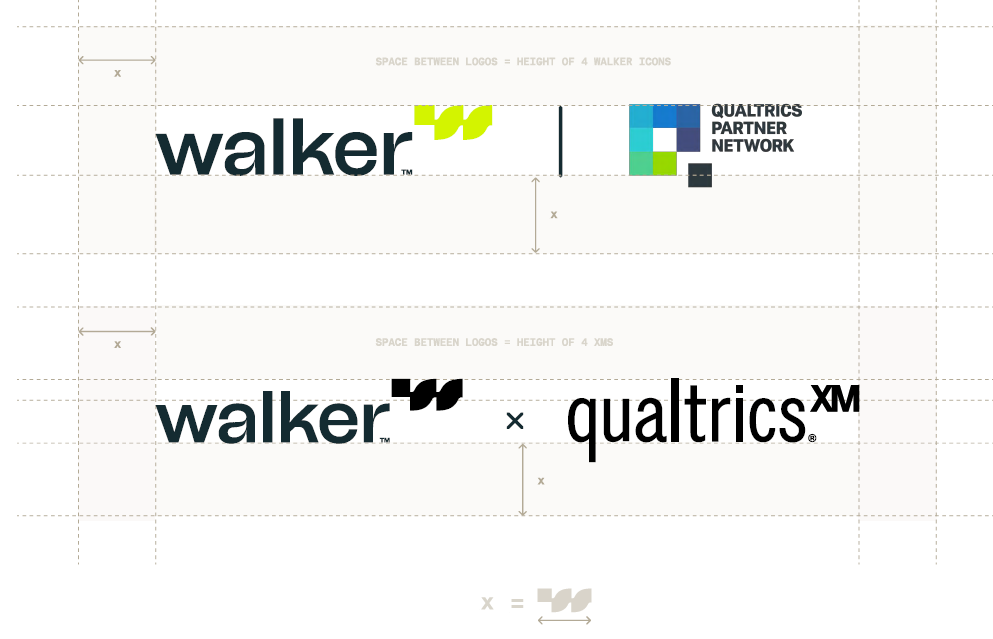
Co-branding lockups visually represent the relationship between Walker and our partners. Our collaborations should be celebrated and portrayed as two equal partners coming together for a common cause.

A clear space equal to the width of the Walker icon must be maintained around the entire lockup in every application. No other visual element may intrude within this clear space.

Logo usage

Clear space and minimum sizing

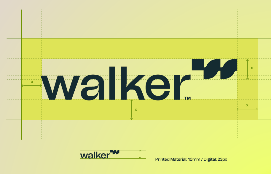
The clear space defines the minimum area in which no other graphic elements are permitted. This ensures that the logo is still appropriately prominent even in very compact layouts. Ideally, however, the blank space around the logo should be considerably larger. Please refer to these guidelines when placing the logo in composition.

The Walker logo must maintain legibility at all sizes. For this reason, a minimum size requirement has been outlined for both print and screen resolutions. Please keep to these dimensions when sizing the logo.

Logo color use

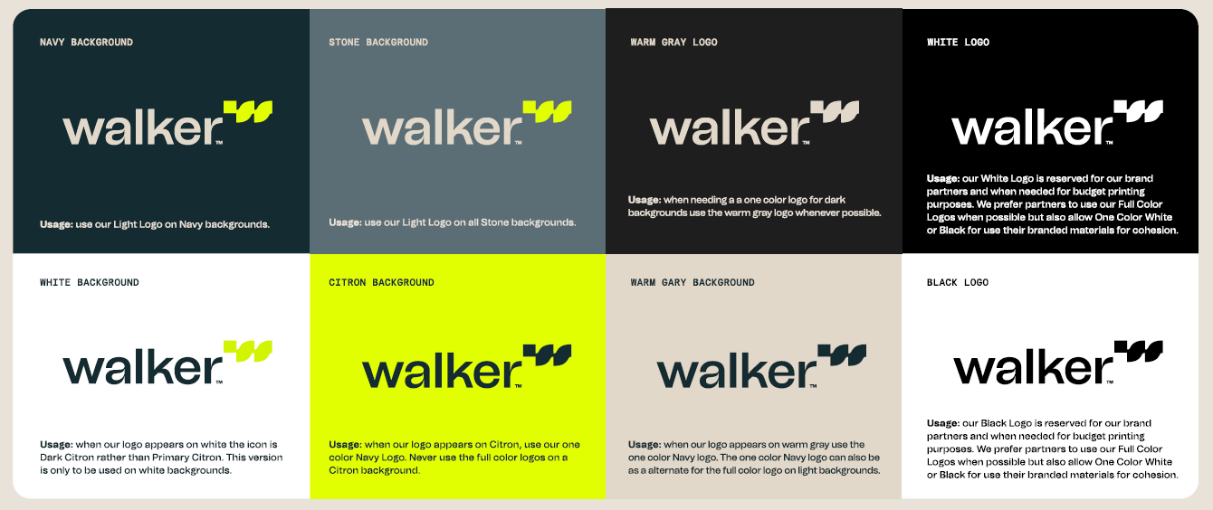
When working with the Walker logo, use the following background color and logo pairing guidelines to ensure proper visibility across all platforms.

Background use

These guidelines help keep the Walker logo visible across all platforms and backgrounds. When the logo appears over a lighter image, you can add a 10-20% black transparency to darken the photo, then apply the warm gray logo over that.

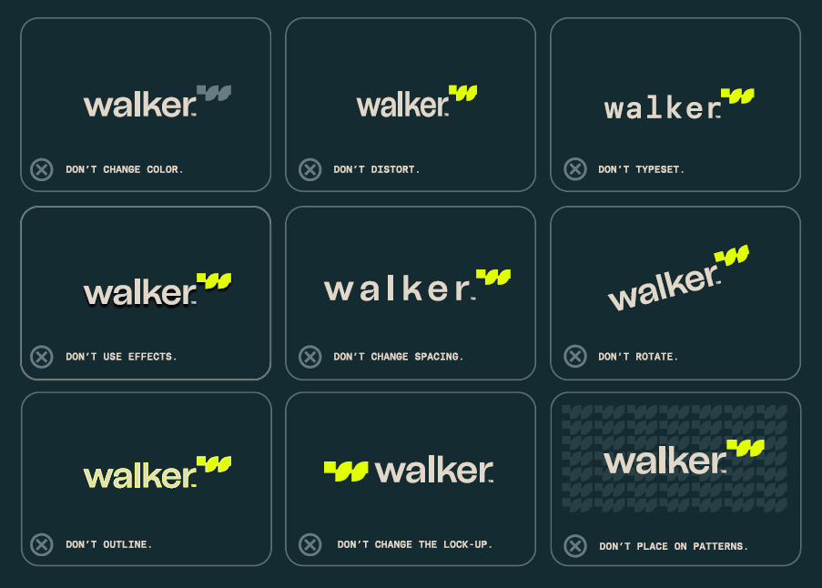
For brand consistency, the Walker logo should not be altered. The following are examples of treatments that are not permitted:

If you have any questions about Walker Hub, please contact a member of the marketing team or send an email to brand@walkerinfo.com.